A guide to the My Plate icon
Jun 14, 2011, Updated Feb 14, 2012
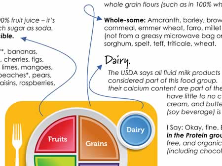
By now you’ve probably seen, or at least heard about, the new “My Plate” icon. If you’ve taken a moment to click over to the USDA’s ChooseMyPlate.gov website, you’ve also seen that they have seven key takeaways as part of the 2010 Dietary Guidelines (sadly, only one of which is actually conveyed by the icon), along with lots of explanatory information about the icon and the Guidelines.
The icon is, by intent, incredibly simplistic. I’m actually a fan overall, since it distills everything down to the essences (and as I’ve said before, I love that it’s a plate, not a pyramid).
So the website is needed to back up the icon with supporting information and (mostly good) advice. But what if you’re in your kitchen, not at your desk? How do you know if your meal is going to stack up?
Simple! Just print out this free Guide to the My Plate Icon, and post it on your fridge for the whole family to see. Do it. Do it now!
The Eating Rules Guide to the “My Plate” Icon (8 ½” x 11″ one-page PDF, 265kb)
If you’d like to share this guide on your own website or blog, please be respectful (and law-abiding) and share it by linking directly to this post. Please do not link directly to the PDF or copy the PDF to your own server. Thanks!







The My Plate icon superficially resembles the PCRM plate, but there’s a world of difference. The only difference between the USDA’s current “My Plate” and its 1956 “Basic Four” food groups is that the Meat group has been renamed “protein” (even the original “meat” group included beans) and fruits and vegetables are now in separate groups. Even calling one group “protein” provides the misleading impression that the other groups lack protein. Unfortunately, the USDA is still urging people to eat plenty of meat and dairy foods in order to make sure that they get “enough” protein. Yet it’s practically impossible to find any documented cases of pure protein deficiency or calcium deficiency in the medical literature. Meanwhile, the meat and dairy foods are the major contributing causes of our major causes of death and disability. There’s no need for meat or dairy foods and no justification for encouraging people to… Read more »
Have you seen Harvard’s answer to the My Plate icon? Guessing you might like it a little more. 🙂
Harvard’s system isn’t really much better than USDA’s, and the people at Harvard should know better because they’re supposed to be smart. It’s illogical to sort foods into fruits, vegetables, grains, and proteins. The first three categories describe a kind of plant tissue that tends to have certain properties. The fourth category describes a class of chemicals found in all living tissue. Protein is also found in substantial amounts in grains and vegetables! In other words, the categories aren’t mutually exclusive. Vegetables and grains provide all of the protein that human beings would need, yet they aren’t included in “protein,” thus falsely implying that people must eat something other than vegetables and grains to get enough protein. Furthermore, some of the particular bits of advice that the Harvard system gives aren’t supported by scientific evidence. There’s no reason to recommend that people eat poultry or fish. People should be told… Read more »
ME ENCANTO. I LIKE IT A LOT
The plate graphic is easier to understand than the pyramid, but it still gives bad nutritional advice: http://wheredogorillasgettheirprotein.blogspot.com/2011/06/plates-not-much-better-than-pyramid.html
The Physicians Committee for Responsible Medicine has a much better plate graphic, one that gives advice that can restore people to health: http://wheredogorillasgettheirprotein.blogspot.com/2011/06/pcrms-plate-is-better-than-usdas.html
Hi Laurie.
I think, as an icon, the My Plate graphic is significantly better than the Pyramid. The dietary recommendations that go along with both the pyramid and the plate haven’t actually changed all that much.
I do think that the shift from “Meat” to “Protein” is a step in the right direction. Yes, it may be overkill to have the protein category at all, as you point out on your blog, but at least now according to the guidelines, protein doesn’t have to come from animal sources.
I specifically disagree with a few points of the icon. In particular, “Dairy” should simply be a part of the “Protein” category. Additionally, it should be “Proteins” (plural) — which would help imply more variety (other than meat).
If you look at it that way, the My Plate icon isn’t too far from the PCRM plate… 🙂
Excellent work, Andrew!
Thanks!
Andrew, I’m glad to hear your perspective on this, because I like the new structure, too, in many ways. It takes away the rigidity of the pyramid, which seemed to imply that if you weren’t following it by number of things eaten, you weren’t going to be a healthy person. My Plate allows for different lifestyles and cultures to apply it for healthful living, and gives everyone control over the answer, within a certain set of guidelines.
You’re absolutely right. This new icon allows for flexibility. I do wonder, though, if it’s too flexible? Will people eat un-healthfully while thinking they’re eating well?
Really fantastic, Andrew! Really nothing to add to your excellent work.
Despite obvious bowing to various Big Food lobbies (and other widely-covered shortcomings), I do feel like the plate is a huge improvement since a mountain-like pyramid of food was just ridiculous! I generally think that I’m past the USDA needing to tell me how to eat (shudder shudder), but I think this is a useful visual for those that are just learning about eating well.
Thanks!
Thanks! The problem with “Population-Based Recommendations” is that they have to cater to, well, everyone… Which doesn’t leave much room to accommodate individual needs. But yes, I think the plate (and accompanying website/info) is a good starting point.
This morning, Kristin Wartman posted a great article summing up some of the problems with My Plate (many of which I hinted at in my PDF). Worth the read:
http://civileats.com/2011/06/15/my-beef-with-myplate/
Excellant. I wonder is there’s an app yet. That would be handy when you’re out and about.
Great idea! (I just searched the App store, but didn’t come up with anything. I bet it’ll be just a few more weeks before something turns up.)
love love LOVE this. Great summary and who doesn’t love a cheat sheet??? i do like that they say “Protein” and not “Meat”…(not just b/c I’m vegetarian) it broadens that group. And i am a fan of “rainbow” foods. Glad you mentioned that. Thanks!
Thanks, Amee! Glad you like it.