The Cooking Oil Comparison Chart
Last Updated June 28, 2020 · First Published February 13, 2012

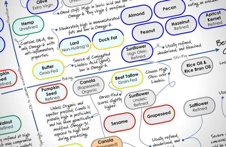
You already know that Extra Virgin Olive Oil is good for you. But what do you choose when it’s time to branch out and try something new? There are a lot of cooking oils out there, and many have misleading health claims on the label. It can be a bit overwhelming when you walk down the oil aisle in the store.
Some oils are very healthful, others not so much — and for different reasons. How do you know what’s really important when choosing a cooking oil? And how do you keep track of them all?
Why, with The Cooking Oil Comparison Chart, of course!
I’ve teamed up with Andy Bellatti, MS, RD, to help answer these questions with this chart. (If you don’t already follow Andy, you’re missing out.) We’ve created a one-page, printable PDF that you can take with you to the grocery story (or stick up on your fridge), that will help guide you through the labyrinth of oils.
We focused on two main factors, healthfulness and temperature-sensitivity, since some oils lose their health benefits when heated. Using a grid that makes it easy to see where each oil falls on the spectrum, you’ll be able to tell at a glance which oils to use for your salad, and which to use for your next stir-fry — and which oils to avoid altogether. We’ve also included some secondary details about each oil, along with some important pitfalls to watch out for.
Andy has written a post on his blog explaining the science behind our oil comparisons, so you’ll know why each oil is where it is on the chart. So click on over to Andy’s post to get the nitty-gritty, and then come back here and get the PDF.
The Cooking Oil Comparison Chart
792kb PDF, Last updated June 20, 2017
—
If you’d like to share this chart on your own website or blog, please be respectful (and law-abiding) and share it simply by linking directly to this post. Please do not link directly to the PDF or copy the entire chart to your own site. You may use the image at the top of this post on your own page, if you like. Thanks!
—
PS – Huge thanks to Andy for jumping on board when I proposed this project to him. I had a ton of fun collaborating with him, and appreciate his enthusiasm and expertise!
—
You may also like my other printables:
The Healthy Breakfast Flowchart
The Smoothie Flowchart
A Guide to the My Plate Icon
How to Read the Nutrition Facts Panel


good comparison
Your chart is so confusing
Would it be ok if our company distributed these to all our units kitchens to hang on their walls so they can refer to it quickly?
Sure! Feel free to print ’em out and send them around. Thanks for asking! 🙂
This chart looks very healthy … i would like to know more about smoke point . How to compare each type of refined-oil with smoking capacity ? could you please explained …
Thanks for this Andrew! I don’t see vegetable oil in this chart . could you give me information about it please.
I found your oil chart so useful. I teach Business English and I will have a demo class for a company which actually produces cooking oil. The chart will be very useful to create activities for them ,besides helping them decide what the best oil is. Thanks alot!